
A group of young Napa Valley winemakers hired Mel to design an identity and collateral for their vintage focused on millennial entrepreneurs, Flora & Candor.
The winemakers wanted to be as transparent as possible during the process of building their brand, keeping authenticity is at the heart of their business. Play was a big part of this journey, as was being open-minded while exploring an often conservative arena.


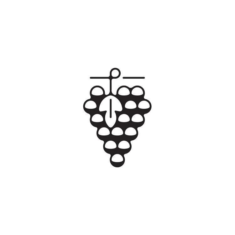

Mel developed a logo that served as a nod back to the deep heritage of winemaking, but with a youthful update. Further elevating the idea of playful transparency, we created a label that quantifies the ingredients (physical and emotional) that went into making the wine, and directed a series of icons that further tell their story. Clean typography with round letterforms and quirky details reinforce this structured system that doesn’t take itself too seriously.