While living in San Francisco, I encountered a fascinating writer that was experimenting with perfume as a means of self-care. She was incredibly well traveled and wanted to bring much of that experience to her creations. She came to me to help discern her brand’s ethos, and develop visuals.
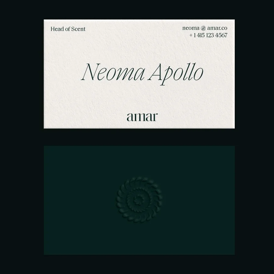
Amar means many things in different languages — forever, immortal, long-lived, moon, and to love. The ideas of alchemy, timelessness, and anointing were at the core of the perfumer’s practice. The visual system conveys these amorphous and quite magical ideas in an elegant and unexpected way.
A circle with alternating rows of droplet shapes – mimicking the ball terminals in Schick Toikka’s typeface, Saol – brings to mind the center of a sunflower, or droplets of oil forming on the surface of still water. The palette is anchored in a deep emerald green – speaking to wet rocks, verdant forests, and mysterious skies.
I designed a two- tiered, hollow disk-like vessel in Adobe Stager meant to impart the feeling of carrying a heavy river stone in one’s hand. It was important for the bottle to have both visual and physical weight. It is housed in a marbled box with discrete branding to encourage reuse.